A man far cleverer than me once said that we strive for excellence when mediocrity will do.
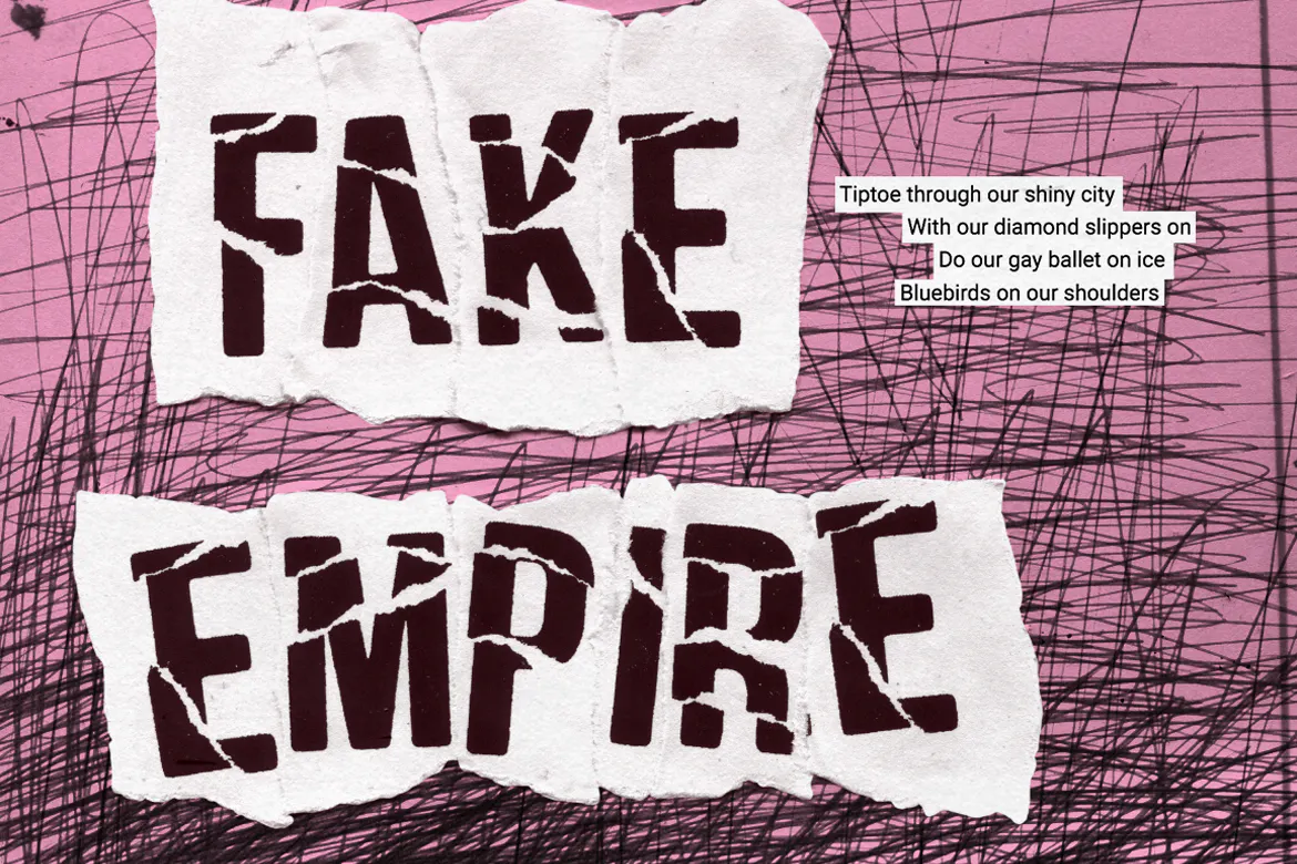
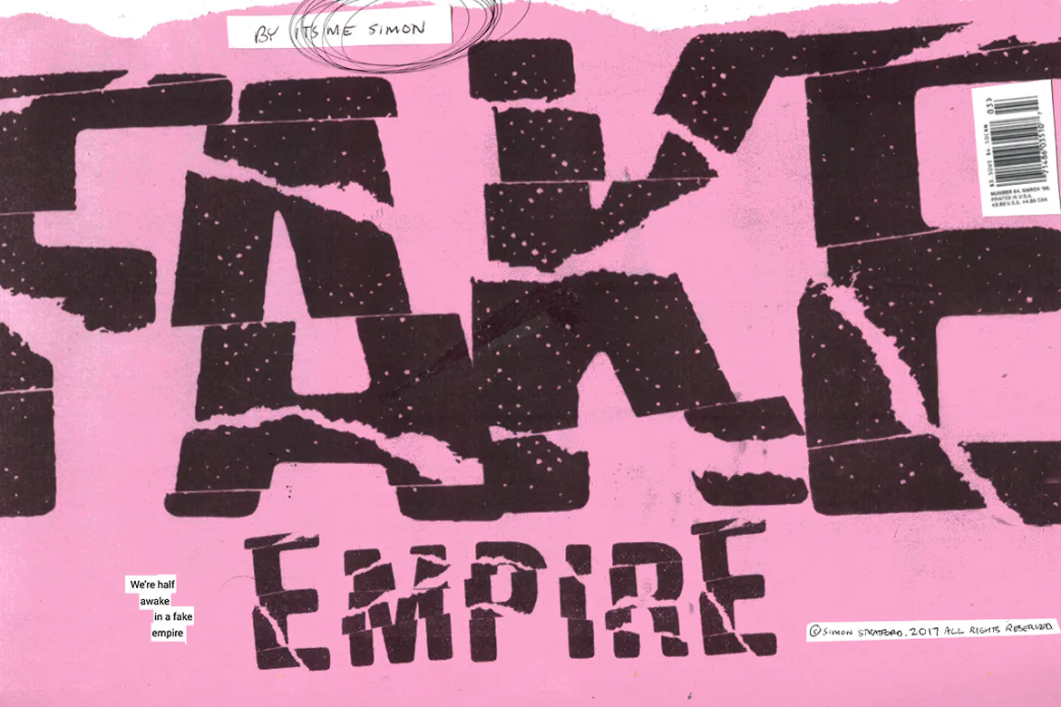
That pretty much sums up my new font called Fake Empire.
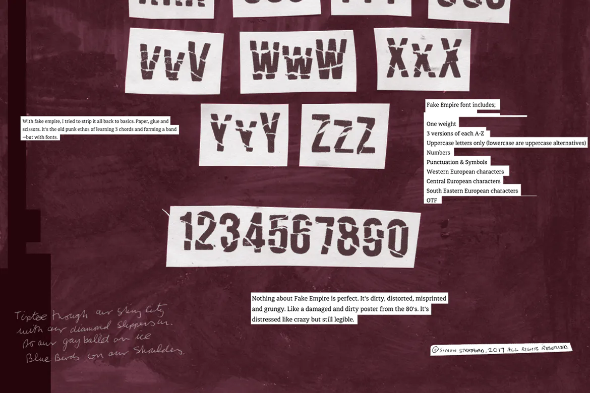
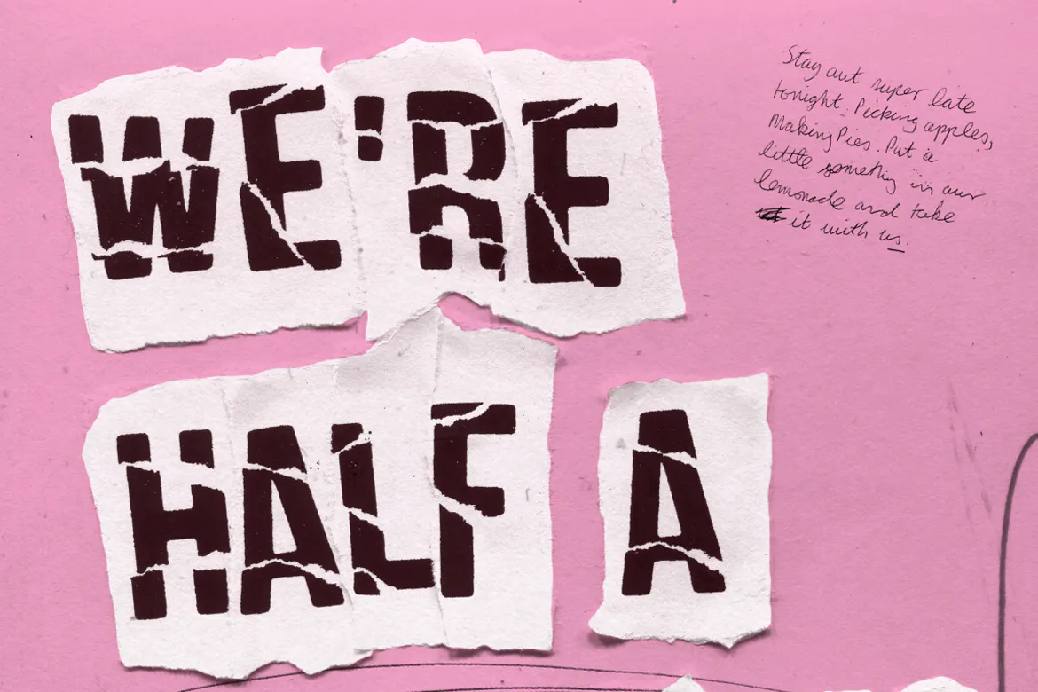
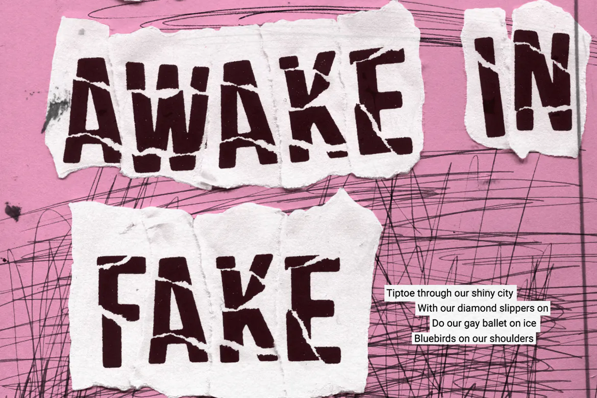
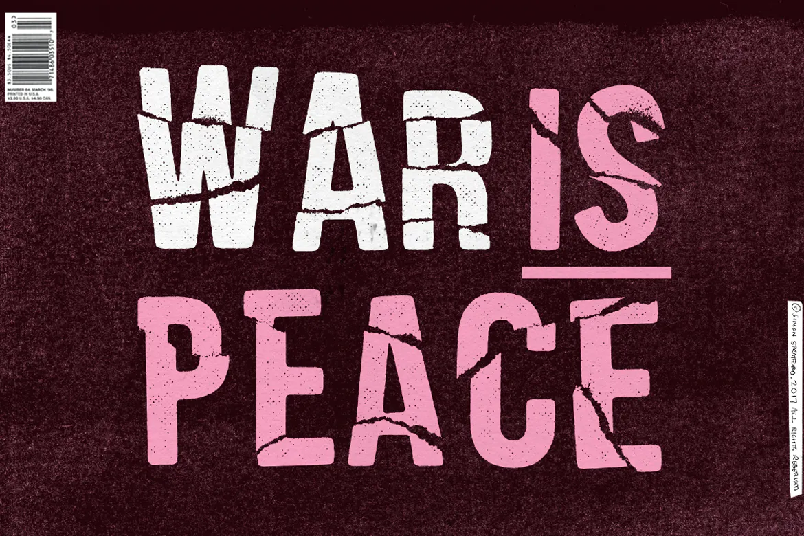
Using nothing more than paper, glue and scissors, I've stripped it back to the basics—getting my hands dirty in the process.
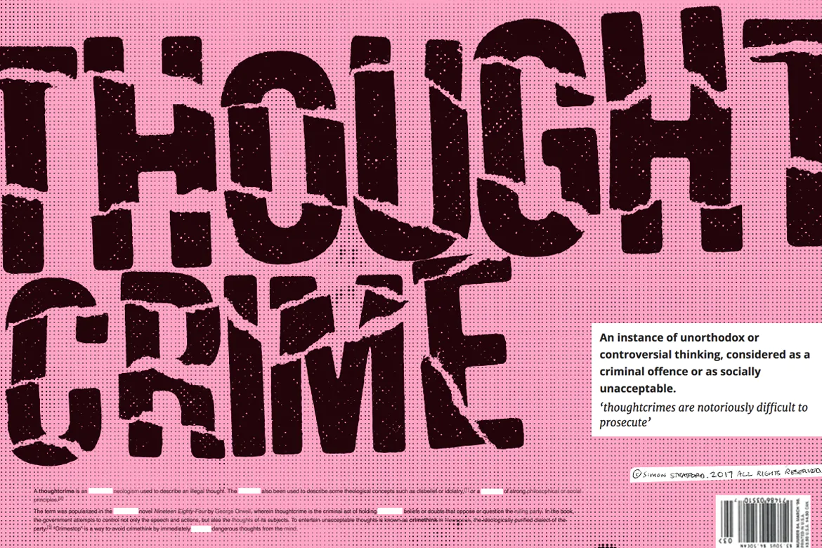
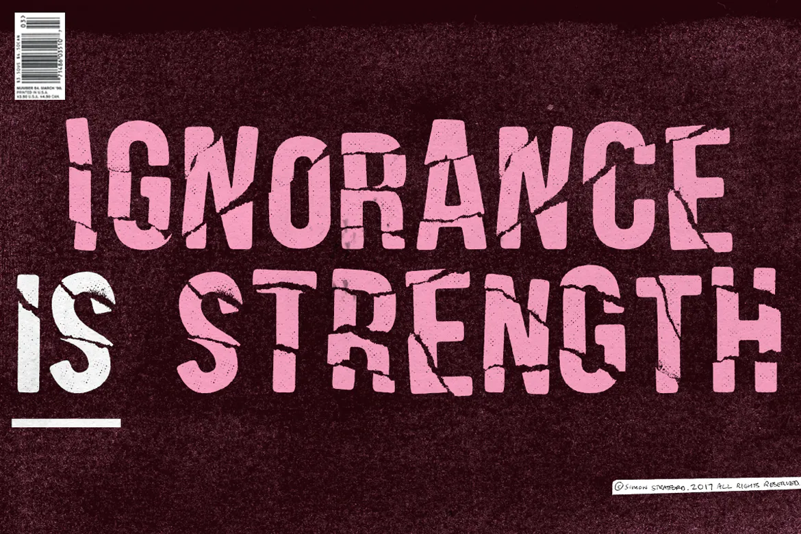
Fake Empire is not perfect. It's faulty, flawed and defective. It celebrates the fact that its crude, dirty and damaged goods.
The font is highly detailed and is best suited for headlines and display.
The font format is .OTF
Fake Empire font includes;
- One weight
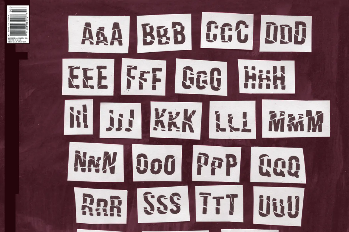
- 3 versions of each A-Z
- Uppercase letters only
- Numbers
- Punctuation & Symbols
- Western European characters
- Central European characters
- South Eastern European characters
- Font format is .OTF
声明:本站所有文章,如无特殊说明或标注,均为本站原创发布。任何个人或组织,在未征得本站同意时,禁止复制、盗用、采集、发布本站内容到任何网站、书籍等各类媒体平台。如若本站内容侵犯了原著者的合法权益,可联系我们进行处理。


评论(0)